counter
Showing posts with label colour theory. Show all posts

Thursday, 10 November 2011

A Truly Liveable Space Needs a Nourishing Colour Palette

Equinox by Hans Hofmann, Choose nourishing palette for your mind and soul, collage by wobuilt.comCollage: Choose a Nourishing Palette for Your Mind and Soul
Image credits: “Equinox” by Hans Hofmann, 1958, painting
MS Office ClipArt: Paint can and paintbrush

2011 @ wobuilt.com

“The whole world, as we experience it visually, comes to us through the mystic realm of color. Our entire being is nourished by it.”
Hans Hofmann
If the above quotation by American abstract expressionist painter Hans Hofmann is considered in the context of our living spaces, the choice of colour should never be left to a complete stranger.

When Wo-Built completes a building or renovation project, they often deliver a “blank canvas” to their clients. This usually means white walls primed for interior design and finishing—in a word, colour.

So what do you do when presented with a beautifully designed space yearning for a personal expression of colour that will “feed your being” for years to come?

For starters, you might want to read-up on the psychology of colour. Don’t make the mistake of simply going with “what looks nice,” in a magazine or on a colour swatch. Our perception of colour changes over time. To test this theory, go into your closet and find that outfit you’ve only ever worn once.

Generally, colours are categorized as warm (red, orange, yellow) or cool (blue, green, violet). Warm colours enliven and are associated with higher energy, while cool colours promote serenity and tranquility. Blue is especially calming. Red and orange are said to stimulate hunger, while blue is said to curb it. Yellow can be cheerful, while violet promotes creativity, but both can get tiresome quickly.

Another factor to consider is colour combination. A monochrome colour scheme (different variations of the same colour), provides a soothing effect. A little more audacious is a colour scheme based on similar colours. A contrasting colour scheme is most dynamic, with colours appearing brighter than they actually are, and is best suited to high-activity areas like the kitchen; these can also get tiresome.

There is one more approach to consider: let your furniture and artwork be your colour! With some well-placed “accent walls” painted to draw focus and separate spaces, the rest of the space can remain just as it was delivered by Wo-Built: a clean canvas “painted” by your interior pieces; personal style.

Finally, don’t worry about impressing others with your “sense of colour.” Instead, choose a “nourishing palette” for your mind and soul. This will support a truly liveable space. Guests will respond to the positive energy of a space more than they will to a designer colour palette.


Attila Lendvai
VP of Strategic Development
Wo-Built Inc. - Innovative Design and Build

You can read other related articles here:
wobuilt.com/blog: How many paint colours?!

wobuilt.com/blog: Paint Colour Trends 2008... Are you making the most of your investment?
by Sylvia O’Brien

wobuilt.com/blog: Colour for Your Home and Your Life: Intention Of Space
by Lonya Miller

Tuesday, 20 January 2009

Colour for Your Home and Your Life: Classic Colour Schemes

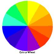
Colour WheelColour Wheel

This is part three of our series of articles entitled "Colour for Your Home and Your Life with Wo-Built Inc."
Classic Colour Schemes

There are many colour schemes to choose from and below you will find a few combinations that Wo-Built would recommend. In selecting your particular colour scheme, these are a few of the basic combinations that work together and will help you to create the particular mood that would complement the design of your space.

1. Monochromatic Colour Scheme
The monochromatic colour scheme uses variations in lightness and saturation of a single colour. This scheme looks clean and elegant. Monochromatic colours go well together, producing a soothing effect. The monochromatic scheme is very easy on the eyes, especially with blue or green hues.

2. Analogous Colour Scheme
The analogous colour scheme uses colours that are adjacent to each other on the colour wheel. One colour is used as a dominant colour, while the others are used to enrich the scheme. The analogous scheme is similar to the monochromatic, but offers more nuances.

3. Complementary Colour Scheme
The complementary colour scheme consists of two colours that are opposite each other on the colour wheel. This scheme looks best when you place a warm colour against a cool colour. An example would be red versus green-blue. This scheme is basically high contrast.

4. Split Complementary Colour Scheme
The split complementary scheme is a variation of the standard complementary scheme. It uses one colour and the two colours adjacent to its complement. This provides a high contrast without the strong tension of the complementary scheme.

5. Triadic Colour Scheme
The triadic colour scheme uses three colours equally spaced around the colour wheel. This scheme is popular among artists because it offers strong visual contrast while retaining harmony and colour richness. The triadic scheme is not as contrasting as the complementary scheme, but looks more balanced and harmonious.

6. Tetradic (Double Complementary) Colour Scheme
The tetradic scheme is the most varied because it uses two complementary colour pairs. This scheme is hard to harmonize, if all four hues are used in equal amounts, the scheme may look unbalanced so you should choose a colour to be dominant or subdue the colours.
Lonya is the staff writer for Wo-Built Inc.

links:
Wobuilt Inc.: Kitchen Color Trends
Wobuilt Inc.: Paint Colour Trends 2008... Are you making the most of your investment?
Wobuilt Inc.: How many paint colours?!
Wobuilt Inc.: Colour for Your Home and Your Life with Wo-Built Inc. (Part 1)
Wobuilt Inc.: Colour for Your Home and Your Life: Intention Of Space (Part 2)
Wobuilt Inc.: Colour for Your Home and Your Life: Classic Colour Schemes (Part 3)

technorati tags:
91 posts tagged
10 posts tagged
39 posts tagged

Friday, 16 January 2009

Colour for Your Home and Your Life: Intention Of Space

Floral Circle Design
Image: Four color floral circle design

This is part two of our series of articles entitled "Colour for Your Home and Your Life with Wo-Built Inc.". In part one we explored a brief history of the colour wheel, psychology of colour to help you choose the right colour combinations that will work for your home!

Intention Of Space

In interior spaces, the right colours will support the purpose of the space. The wrong colours can challenge its function. These ideas are the foundation of visual ergonomics. Visual ergonomics uses applied colour psychology to produce a specific visual mood. Think of the different functions of space such as, lobbies, hospital, spas and bedrooms. Within each setting, a different set of visual ergonomic rules apply.

When selecting a colour, begin by asking questions such as:
  1. What tasks are carried out here?
  2. What kind of image do you want to project?
  3. What mood do you want the space to have?
  4. What kind of a first impression do you want to create?
By answering these questions, you will already have a good idea of which direction to go in and which colours would best create the visual ambiance you are looking for.

Below is a chart with several meanings for each colour. However particular colours may elicit other emotions in certain people. Therefore it is important to use your best judgment when deciding on a colour scheme and to get feedback on the colours that you use.

Colour Meaning ChartColour Meaning Chart

Lonya is the staff writer for Wo-Built Inc.

links:
Wobuilt Inc.: Kitchen Color Trends
Wobuilt Inc.: Paint Colour Trends 2008... Are you making the most of your investment?
Wobuilt Inc.: How many paint colours?!
 
Wobuilt Inc.: Colour for Your Home and Your Life with Wo-Built Inc. (Part 1)
Wobuilt Inc.: Colour for Your Home and Your Life: Intention Of Space (Part 2)

sessions.edu: Using Colors to connect With Your Audience

technorati tags:
90 posts tagged
10 posts tagged
34 posts tagged
1 post tagged

1 post tagged
9 posts tagged

Tuesday, 13 January 2009

Colour for Your Home and Your Life with Wo-Built Inc.

Colour WheelColour Wheel

Further to our previous articles on colour trends Wo-Built would like to expand on the importance of colour in your life and how it can work for you in your home.

Choosing a Colour Scheme For Your Home

When choosing a colour scheme for your home, the colour wheel can be your best friend in helping you to harmonize your colours and to create the mood that you are looking for. In the following weeks we will explore the history, psychology and different colour schemes to help you choose the right colour combinations that will work for your space!

A Brief History of the Colour Wheel

Colour theory is a set of principles used to create complementary colour combinations. Colour relationships can be visually represented with a colour wheel, the colour spectrum wrapped into a circle. The first colour wheel has been attributed to Sir. Isaac Newton, who in 1706 arranged red, orange, yellow, green, blue, indigo and violet into a natural progression on a rotating disk. As the disk spins, the colours blur together so rapidly that the human eye sees white. From that point the organization of colour has taken many forms, from tables and charts to triangles and wheels.

Psychology of Colour

Can colours change how we think, feel and perceive things? Most definitely! Colour plays a vital role in the world in which we live. Colour can change the way we think, change actions, and cause reactions. It can irritate or soothe your eyes, raise your blood pressure or suppress your appetite.

The power of colour is something that most people are unaware of. It is important that we live with the colours that best suit our personalities so that we can enjoy a more contented and healthier life.

Lonya is the staff writer for Wo-Built Inc.

links:
Wobuilt Inc.: Kitchen Color Trends
Wobuilt Inc.: Paint Colour Trends 2008... Are you making the most of your investment?
Wobuilt Inc.: How many paint colours?!


technorati tags:
85 posts tagged
9 posts tagged
28 posts tagged
34 posts tagged

Posts tagged colour+scheme per day for the last 90 days.
Technorati Chart
Get your own chart!

Thursday, 23 October 2008

Kitchen Color Trends

Kitchen Colour Trends: Home in the kitchen
Uploaded on flickr by moline on 23 Nov 2007
© All rights reserved.

When considering a kitchen renovation it’s important to be in the know about what the current trends are. In the following few weeks Wo-Built will look at some of the emerging trends this season so that your kitchen can be as fashionable as it is functional!

2. Kitchen Colour Trends

This year there is an unusual colour palette for kitchens that has gained popularity as being the 'hot' colours of the season. Black is the top choice for kitchens this season, as well as a wide range of shades of grey. There are a variety of grays to choose from including warm grays, dark grays and even grey/brown. Black can make a wonderful backdrop for colour contrasts and can also be a great accent colour. This particular duo will make a dramatic statement in any kitchen!
Lonya is the staff writer for Wo-Built Inc.

links:
Wo-Built Inc.: Renovation Design Tips
Wo-Built Inc.: Kitchen Design Tips
Wo-Built Inc.: Limited Offer: Get Your Free Kitchen Renovation Consultation
Paint Colour Trends 2008... Are you making the most of your investment?
by Sylvia O’Brien
How many paint colours?!
by Sylvia O’Brien


technorati tags:
237 posts tagged
2,454 posts tagged
4,585 posts tagged
512 posts tagged
71 posts tagged
401 posts tagged
1 posts tagged

Posts tagged color+trends per day for the last 30 days.
Technorati Chart
Get your own chart!

Thursday, 20 December 2007

Paint Colour Trends 2008... Are you making the most of your investment?

Paint Colour Trends 2008Paint Colour Trends
Images No: 0510560, 0746540, 0313295 from Canstockphoto
Copyright reserved


In our recent past minimalist trends in decorating dictated only a whisper of colour for the walls. Pale and neutral prevailed, but that has changed and colour has regained importance. Changing paint colours is the most effective way to inject newness into our environment. After all, as far as interior paint colour goes, investing in an sunflower yellow wall is not as major a commitment as buying a sofa in that hue!

New trends in paint colour for interiors indicate greens are still vital. The colour of nature and growth, the newest greens echo the colour of chlorophyll, like the first sprouts of spring, or green bamboo, or that slice of lime in our gin and tonic!

Orange and red have joined forces to create new looking tones of persimmon, copper & coral. Interior paint colours are becoming less & less shy as colour theory and colour psychology have been introduced to the mainstream.

Yellow alert! As a trend yellow is more important than ever. Try a sun yellow room, or a marigold wall, or at least some yellow accessories. The newest yellows have a lot of punch, and work best when grounded with a neutral...such as grey. Take a look at Glidden’s “Ginger Ale”. Glidden cited ”Ginger Ale” as their #1 trend colour for 2008 (think buttercup).

Blues have been strong since the turn of this century, but in 2008 all types of aquatic blue tones are strong. The best ones have some warmth in them and look like blue tones pulled from nature....blueberries, the Atlantic Ocean, the Prairie sky, the periwinkle flower.

Graphite, Flannel, Silver... all rich sounding names for the latest rich neutrals, look best in anything from icy pales to dark midtones. Pair the deep grey tones with soft coral or pale yellowy greens for the newest combination. Pair icy silver grey with warm golden yellow. Look to black as an accent colour for smaller pieces and accessories for interior layering.

Next time I’ll talk about exterior paint colour. In the meantime have some fun with paint colours inside your home .... it’s a reflection of you!
_______________________________________________________
This article was contributed by Sylvia O’Brien, colour consultant and creative director of Colour Theory, a Toronto based firm that helps clients pick the perfect colour for paint, flooring, cabinetry, countertops etc. for their living and working spaces. Colour Theory helps clients pick colour for interior and exterior paint, flooring, cabinetry, tiles, countertop, roofing, siding, aluminum, vinyl and hard landscaping.
To learn more call 416-766-6789 or go to www.colourtheory.net


links:
Wobuilt Inc.: How many paint colours?!
by Sylvia O’Brien


technorati tags:
5,043 posts tagged
1 post tagged
30 posts tagged
63 posts tagged
No posts tagged
17 posts tagged
15 posts tagged
No posts tagged


Posts that contain paint color trends per day for the last 30 days.
Technorati Chart
Get your own chart!

Posts that contain paint colour per day for the last 30 days.
Technorati Chart
Get your own chart!

Wednesday, 28 February 2007

How many paint colours?!

Image:HSLSphere.svg Author: Mike Horvath
From Wikipedia, the free encyclopedia
This image is licensed under the Creative Commons

Wonder why a trip to the paint store to choose colour can be overwhelming? Should be simple....right? You don’t have to study colour theory or colour meanings to make a decision. After all you know what you like...right? Once you’re faced with a wall of thousands of paint colour chips it’s easy to become trapped in indecision because there’s actually too much choice!

A consumer living in an urban centre and looking for interior or exterior paint colour has an estimated 20 to 30,000 options. Benjamin Moore has over 2500 colours, Parapaint a couple of thousand, Pittsburgh another couple of thousand...and on it goes. But Glidden? Well, Glidden has 6000 colours they can formulate. Glidden is the grandmother of paint colour offering.

As a colour consultant, I’ve noticed that each paint company has it’s own ‘personality’ in the colour palette it offers. For example Benjamin Moore and Pratt & Lambert have a lot to offer in the ‘historic’ look... murky and aged-looking colours that change a lot during the day and into the evening. Sico, Para and Pittsburgh are known for clear colour and strong pigment. Para and Pittsburgh have some fantastic ‘almost blacks’. Glidden has a lot to offer in more interesting pale tones (probably due to their 6000 colours!).

So, how to narrow it down? Determine which paint company’s palette you generally like the look of and try to keep within that company’s offering. Test the colours you think you’ll like (some of the companies mentioned have test pots you can buy... if not buy the smallest can to test the colour). Whether you’re selecting interior paint colour or exterior paint colour, this testing is a valuable step.

It’s amazing what happens to colour when you start to spread it around!
_______________________________________________________
This article was contributed by Sylvia O’Brien, creative director of Colour Theory, a colour consulting firm in Toronto, Canada.
Colour Theory helps clients pick colour for interior and exterior paint, flooring, cabinetry, tiles, countertop, roofing, siding, aluminum, vinyl and hard landscaping.
To contact Colour Theory call 416-766-6789 or visit the web site at www.colourtheory.net


links:
Wo-Built Inc.: Paint Colour Trends 2008... Are you making the most of your investment?
by Sylvia O'Brien


technorati tags:

43 blog posts tagged
84 blog posts tagged
3,852 blog posts tagged
20,299 blog posts tagged
5 blog posts tagged
50 blog posts tagged
No blog posts
6 blog posts tagged
No blog posts
No blog posts
21 blog posts tagged
127 blog posts tagged
12 blog posts tagged
37 blog posts tagged
No blog posts
No blog posts


Posts that contain "color consulting per day for the last 30 days.
Technorati Chart
Get your own chart!

Posts that contain "colour consulting per day for the last 30 days.
Technorati Chart
Get your own chart!