counter

Wednesday, 26 October 2011

Happy Diwali: Festival of Lights

Happy Diwali:  Children's Book Of Celebration 2011, collage by wobuilt.comCollage: "The Children's Book Of Celebration" 2011
Publication of Regional Maple Leaf Communications Inc.
Illustrations by Cecilia Camet
Credit: regionalmapleleaf.com

Today is the Hindu holiday of Diwali, the Festival of Lights. I first experienced joyful Diwali or Deepavali celebrations in Singapore when I lived there. The festival of lights definitely owned up to its name with lots of fireworks, colour and light. As a lighting designer and member of IESNA I knew the colorful light displays were a treat to look at. When the Children's Book Of Celebration put our advertising on the Diwali's page, fond memories of the festivals came back.

I love the idea of decorating your home brightly and even doing home renovation prior to an important festival. For me it gives a sense of renewal, happiness, joy and new beginnings. When I look at my own home the best value is always painting; it freshens up the space, gives it a new look and feeling and it is not expensive to do. I also dust off my knick-knacks and change them around to uplift my space.

In the past some of our guest bloggers and decorator gurus had great and inexpensive ideas on how to brighten up your spaces for any occasion. Please click here to read a great article Unique Spaces – Is your home really you? by Ayanna McAlmont, with her guides to homeowners to have homes which reflect who they are at heart. And check Hayley's Hot Tips on Home Decor: Add a Little Bit of Magic into Your Home.


We wish everyone a joyous Diwali and a happy prosperous New Year.


Martina Ernst
President/CEO
Wo-Built Inc. - Innovative Design and Build

Tuesday, 25 October 2011

Forget the Darker Side of Urban Life: Get Yourself Some Stairs and Step up into the Light

Forget the Darker Side of Urban Life: Get Stairs and Light, by wobuilt.com

Photo Collage: Forget the Darker Side of Urban Life:
Get Yourself Some Stairs and Step up into the Light
2011 @ wobuilt.com

"They may be America's last pioneers, urban nomads in search of wide open interior spaces."
Cathleen McGuigan

When it comes to housing, you will pay per square footage according to the following:
  1. Proximity to “happening places;”
  2. How “happening” your place is;
  3. Number of years since your place first “happened.”
Consider downtown Toronto for a moment. If want new apartment on a budget, expect to live in a 300 sq. ft. closet—er ...bachelor. You can save some coin while living relatively close to downtown in a slightly more spacious apartment with not too many creepy-crawly “tenants.”

What is true for condos is especially true for houses. To live near the lake, be it the Beaches, East York, Etobicoke or even Oakville, you might think you have to settle for a tiny bungalow built either at the turn-of-the-century or just after WWII. Welcome to “the dark side” of urban housing compromise.

But let’s take a look at that brand new 300 square foot bachelor studio condo for a moment. From brand new kitchens and stainless steel appliances to high-tech lighting and a murphy bed, a small space can be pretty swanky…when it’s planned and built with state of the art technology and modern design.

The trouble with older houses is that they were designed and built with the technology of their day. Luckily, a house (bungalow, backsplit, whatever) can not only be re-built, it can be expanded and upgraded with space that doesn’t exist yet. All it takes is a little vision to “see the light” of urban living.

Want a 3000 sq. ft. home near the Danforth and the lake instead of an hour north of Toronto? Then transform your 1000 sq. ft. bungalow into a two-story plus loft. (Maybe put a home gym, home theatre or legal apartment for guests or income in your newly re-imagined and bone-dry finished basement).

Are you an urban nomad in search of wide open interior spaces? Don’t search; find the wide open space above your head, beneath your feet, in front or out back. Call a vision builder who specializes in cutting-edge designs with the personal touch so you can step up into the light of a no-compromise urban life.

Attila Lendvai
VP of Strategic Development
Wo-Built Inc. - Innovative Design and Build


links:
wobuilt.com/blog: Another Addition Renovation We Are Proud of: The Wow Factor Approach!

wobuilt.com/blog: Good Daylight Design Strategy for Your Home

Thursday, 20 October 2011

5 Good Ideas Book Launch

Five Good Ideas book launch Toronto, photo-collage by wobuilt.com, photos by Olga GoubarPhoto-Collage: Five Good Ideas Book Launch
October 18, 2011, Toronto's Network Orange;
Hosted by: Author and broadcaster Jane Farrow;
Featured: Interview with the editors, Maytree Chairman Alan Broadbent and
Maytree President Ratna Omidvarand, insights from a panel of contributors.

Photos: Olga Goubar @ wobuilt.com

Five Good Ideas
Practical Strategies for Non-Profit Success
Edited by Alan Broadbent and Ratna Omidvar
Published by Coach House Books, Toronto 2011

Here are some quick thoughts on possibilities for merging profit and non-for-profit worlds in construction industry.

I got dragged out again of the office to attend a book launching event. The event was held at the Downtown Toronto's ING Orange Café, a really interesting community space to hold meetings with a lot of green ideas: living walls, reusing the old warehouse structure, movable walls to reconfigure spaces to suit and many more. The book ‘Five good ideas – practical strategies for non-profit success’ edited by Alan Broadbent and Ratna Omidvar of the Maytree Foundation. I was captivated what some of the contributors mentioned, and I got the book.

On cursory inspection of the index the topics reflected the same issues as running a company: leadership, organizational effectiveness, human resources, resource development, communications, advocacy and governance. So will it be that non-profit organization behave similar to for profit organization? Or will there be differences.

On a personal note, since I tried to help non profit organizations become profitable in one of my former lives, the book will be extremely interesting to see if any of my ideas are reflected. For Wo-Built, since we are spinning out our social mission, this book will be invaluable.

Since I haven't read the book the jury is still out, but if my gut feeling is correct this book is also valuable for any CEO of a construction company. My personal believe is that our industry, the construction industry, should be responsible for implementing its own social initiatives such as apprenticeships, education of the next generation, health and safety issues and more. Some companies are very active in this regard, but we could do so much more as a collective, and not just leave this to nebulous “government”. We, as an industry should look at hybrid solutions, combining our for profit missions with social innovation to provide us with the future labour force the industry can be proud of.

Maybe after reading the book I can report on some of the possibilities of merging the two worlds.


Martina Ernst
President/CEO
Wo-Built Inc. - Innovative Design and Build
links:
nextbillion.net: blog: Development through Enterprise: The Best of Both Worlds? Blending For-Profit and Non-Profit Models
by Shanika Gunaratna

socialedge.org: forum discussion: Creating a Hybrid For-Profit / Non-Profit Social Enterprise Structure
Hosted by Jeff Hamaoui (May 2005 - Closed)

attorneygeneral.jus.gov.on.ca: Ontario Ministry of the Attorney General: Not-For-Profit Incorporator's Handbook

ic.gc.ca: Industry Canada: Federal Not-for-profit Corporations: Create / Maintain a Not-for-Profit Organization

wobuilt.com: blog: Why do so few women choose the skilled trades as a career?

Tuesday, 18 October 2011

When is a Home a Castle?

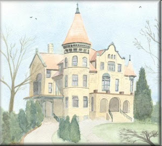
a watercolour painting by John W. Johnston from jwjonline.net; Holway House, La Crosse - a fine castle-style residence in La Crosse, Wisconsin

"Holway House, La Crosse" - watercolour painting by John W. Johnston
Image Credit: jwjonline.net
The personal web pages of John W. Johnston of Northampton, England - JWJ

"Yes, your home is your castle, but it is also your identity and your possibility to be open to others."
David Soul

It’s a very romantic notion: your home is your castle. Some might call it old fashioned, but I like to think of it as never being more relevant than it is today.

Our home is our sanctuary from the world “out there.” Sure, we might have a hi-definition window onto that world, but we watch it from the relative comfort of a sofa, a bowl of comfort food nestled lovingly in our loungewear-clad lap. In moments as these, our home is literally our “happy place.” From romantic nights to family get-togethers; new loves to newborns, the space we live in literally accommodates life’s most cherished people and moments.

It’s no accident that real estate prices increased again in September, with Toronto once again particularly buoyant. Considering the time, energy and money we spend on (and in) our homes, it becomes clear we’re investing in more than just a living space; we’re investing in our own “headspace.”

How do we feel when our space feels “off?” Can we feel we’re standing on solid footing living in an older home with potentially faulty footings? Where is our headspace when our living space was designed for people 50, 60 or even 80 years ago? Is it “our castle” when the walls seem “a little thin?”

Unlike our cranium and grey matter (which we’re more or less stuck with), a complete overhaul of our living space is possible and may be just what we need to overhaul our life! Just think what a total upgrade of your home’s core structures and components will do for your headspace (and heating bills).

Invest in some cool green technology. Build an addition for a home theatre, listening room, Jacuzzi, greenhouse…whatever reflects your headspace right now—or the future. With all the stress “out there,” making your home a castle of refuge for the space “in here” has never been more important.

Attila Lendvai
VP of Strategic Development
Wo-Built Inc. - Innovative Design and Build

Thursday, 13 October 2011

Home Renovation Do’s and Don’ts: What to do before you do anything

Home Renovation 101, some don'ts, discoveries, by wobuilt.comHome Renovation Discoveries: Black Mold,
Spaghetti Wiring, Arching Electricity, Crappy Plumbing.
Look for These and Other "Fun Discoveries".
Image Credit: MS Office ClipArt:
Mans face featuring a pondering emotion
2011 @ wobuilt.com

Today we begin a series on what to do and what not to do when it comes to your home renovation projects. We’ll take you inside one of Wo-Built’s projects to see the reality behind the advice. And, perhaps more importantly, appreciate the impact of not taking our advice…

What do you do before you start any major home renovation project? Call a good general contractor. Why? Because a general contractor has a sense for "the big picture" and an eye for "all the little details," whereas a more specialized contractor or tradesperson may not.

Case-in-point:

Homeowners Bob and Marsha (not their real names), decided they wanted to remodel and renovate their bungalow in East York of roughly 60 to 70 years of age (the bungalow, not Bob and Marsha). So, they went ahead and had the ground floor remodeled with beautiful trim, fresh paint, a remodeled bathroom and had a brand new kitchen.

They were so happy with the way everything looked, they said "Let’s finish the basement now." Only then did they contact Wo-Built to come do the basement, after their main floor renovations. It was only after Wo-Built took down the walls in the new bathroom adjacent to the new kitchen (to get at the black mold and properly insulate the walls to prevent it from returning) that the electrician found a single wire spliced into an electrical box (running on a single 60-70 year old circuit / fuse) powering no less than 5 outlets in the kitchen (in addition to the outlets and fixtures it was powering in the bathroom).

So, someone using a hair dryer in the morning while the coffee maker and toaster is going? What about throwing in a blender for that morning smoothie? It could have turned into quite the morning StairMaster workout to go reset the fuse every morning. Now, Wo-Built has to cut into recently finished and painted walls in a brand new kitchen to fix an electrical wiring oversight by the individual(s) who installed it.

Wouldn’t it have made more sense to have called in a reliable general contractor like Wo-Built to oversee any renovations being planned from the get-go? Isn’t it better for the realistic scope of the project and correct order of work to be determined before a single hammer is lifted? Wo-Built would have been able to spot problems and avoid wasted effort, saving Bob and Marsha time, money and headaches.

And this is just a taste of the "horrors" lurking behind the walls, in the foundation, and elsewhere in the basement of this benign little bungalow in a sleepy little East York neighborhood of Toronto, Canada.

Black mold behind walls of the "new bathroom," the spaghetti wiring with arching electricity and scorched insulation, the complete lack of insulation in some areas, and plumbing that looks like it was put in by a lonely octopus. Look for these and other "fun discoveries" in the weeks to come (i.e. the Halloween edition…for obvious reasons).

Attila Lendvai
VP of Strategic Development
Wo-Built Inc. - Innovative Design and Build
Tuesday, 11 October 2011

Green Renovations: Sharing Experiences and Lessons Learned

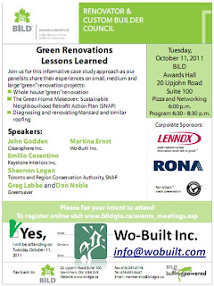
Green Renovations Lessons Learned BILD GTA Toronto event with Wo-Built, October 11, 2011Green Renovations Lessons Learned
BILD Renovator & Custom Builder Council
October 11, 2011; 6:00 - 8:30 pm
Credit: BILDGTA.ca: Meetings & Events

Building, Industry and Land Development
Renovator & Custom Builder Council


Topic: Green Renovations
Lessons Learned


Join Building Industry and Land Development Association for this informative case study approach as panelists share their experiences on small, medium and large "green" renovation projects:
  • Whole house "green" renovation
  • The Green Home Makeover: Sustainable Neighbourhood Retrofit Action Plan (SNAP)
  • Diagnosing and renovating Mansard and similar roofing
Speakers:
John Godden, Clearsphere Inc.,
Martina Ernst, Wo-Built Inc.,
Emilio Cosentino, Keystone Interiors Inc.,
Shannon Logan, Toronto and Region Conservation Authority, SNAP
Greg Labbe and Don Noble, Greensaver.

When: Tuesday, October 11, 2011

Time: Pizza and Networking: 6:00 pm
Program: 6:30 pm - 8:30 pm

Location: BILD Awards Hall
Address: 20 Upjohn Road, North York, ON M3B 1Y2

For more information please contact:
BILDGTA.ca: Meetings & Events

Live Green Toronto: Wo-Built

Our Green Commitment

We are dedicated to being environmentally conscious and have embraced "Green Construction" in all our projects. We strive to be the leading design and build company that is sought after for its innovative design and quality construction and one that is recognized for using their projects as a means to help women, the community and the environment.

Our Special Offer for Members
Incorporate in your renovations the following: green roofs, solar, geothermal or heat recovery measures and save 5% of the retail costs.

Thursday, 6 October 2011

Design in Motion … in a House!?

Jet House by Jerome Olivet Visionary Architecture DesignJerome Olivet Visionary Design: Architecture: Jet House
Image Credit: Jérôme OLIVET Book: Architecture: Plant inspiration

Good Engineering and Beautiful Aesthetics Can Go Hand in Hand in Your Home.
In recent years, there has been an emerging school of thought in design that could be called "motion design" or even "design in motion." From computer animation to automotive, the focus is on designs that look good while moving, not just while standing still. In the automotive world, the approach evolved from ever-more intense aerodynamic testing for performance and fuel efficiency. In other words, it was a natural progression of an age-old tradition in design called "form follows function." When we consider design in motion as another example of form follows function, we can apply the concept directly to home design and layout — and no, we’re not talking mobile homes!

A house is in constant motion. It’s all a question of perspective and relativity. After all, in a wind tunnel test, a car stays in one spot: it’s artificially generated wind that’s really moving; and yet, its aerodynamics can be tested … that is design in motion. In much the same way, rooms, hallways, counters, closets — all these elements stay put. It’s the people living in and around them that move. The motion of a house relates to its occupants. So, if you really think about it, design in motion is perhaps the most relevant consideration when building a house, an addition or any major re-redesign project.

Here are some questions worthy of consideration: in the morning, how many people are there in the house getting ready within the same time-frame? What is the flow of people between bedrooms, bathrooms, kitchen, laundry and hallways? Where are the “bottlenecks”? We live in Canada: does the home have an alternate entrance and/or mudroom where slushy shoes and snowsuits can be removed and stored away from the primary entrance (i.e. the one used by visitors and guests)? Speaking of guests, is there an office or sitting room relatively near the main entrance close to a powder room where surprise guests can be entertained without disturbing the rest of the household? Perhaps that same office can contain a sofa bed or futon to accommodate overnight guests (in which case it’s best the powder room also has a shower for them to use). Is there a handyman in the house? A gardener? How about a laundry room with a shower within easy reach of the garden, workshop, or wherever soiled people and their clothes enter the house?

Of course, people are not the only things that move in a house. Sound is also an element that is in motion; "sound carries." Anyone who has ever lived in a side-split or back-split arrangement will attest to a design which essentially turns the entire house into a single audio zone (and these are very common among the many "cookie-cutter" designs prevalent in the Greater Toronto Area and elsewhere in Ontario). The placement of rooms next to or above other rooms where "noise contamination" may take place is an important consideration. In some cases (positioning a baby room) you may want to hear every sound coming from the adjacent room. Of course, sound carries through houses in sometimes unanticipated ways. Duct-work can channel noise remarkably efficiently. A finished basement with ceiling vents connected to existing duct-work could inadvertently make a direct (and unfortunate) "audio pipeline" between the basement washroom and the main floor kitchen or living room.

Similarly, light is also an element in constant motion. Obviously, over the course of a day, daylight and shadow shift from one side of the house to the other. But in the evenings, artificial light from one space within the home can "flood" an adjacent space quite easily. There can be too much light or not enough given the activities in any particular room. Often, designer fixtures that "look good" in the showroom are sorely lacking in terms of providing adequate light. Finally, new digital dimmers and timers add a whole other dimension of motion—changes in lighting intensity over time.

The point is this: aesthetic considerations of design aside, a home must be lived in. Designing the layout and functionality of a house in motion will result in a more livable home. The key is to work with a designer and/or contractor who has the ability and the patience to take you through the process of understanding the numerous motions the house will go through to determine the best design.

If all this sounds too much like an exercise in engineering and too little like design, remember: good engineering and beautiful aesthetics go hand-in hand. Truly, having one without the other is not very practical when it comes to building anything that "must be lived with" (lived in). However, one thing is absolutely certain: having a home that just "looks good" at first glance will become very tiresome very quickly if it encumbers the natural flow of the people and daily life. Maybe that’s why so many people in Toronto are opting to build additions or have dramatic re-designs and re-builds done on their existing properties — what was aesthetically pleasing once must be brought up to speed of 21st Century living.

As for the "Aerodynamic House" in the image that opens this blog: in the not-too-distant future, global warming and more extreme weather patterns — particularly here in Canada — may indeed begin to play a more critical role in design in motion considerations as they relate to homes. But that, as they say, is a topic for another day.

Attila Lendvai
VP of Strategic Development
Wo-Built Inc. - Innovative Design and Build


links:
Jérôme OLIVET. La boutique

Jerome Olivet Visionary Design

gizmodo.com: home is where the art is: Jet House is a New Look on an Old Design
By Christopher Mascari

Cjacotguth’s Blog: Research: Aerodynamic House
By Charlotte Margareta Jacot Guth

luxist.com: The Jet House, Sleek Aerodynamic Living
by Rigel Celeste

Tuesday, 4 October 2011

Good Daylight Design Strategy for Your Home

Good Daylight Design Strategy for Your Home, by wobuilt.comCollage: Mirror, mirror on the wall,
What is the best light source of all?
- Daylight, sunlight is best of all!
Image Credit: MS Office ClipArt: Homes, Houses, Mirrors
2011 @ wobuilt.com

Mirror, mirror on the wall, what is the best light source of all? - Daylight / sunlight is best of all.

Wouldn't be great to have a magic mirror that can give a definitive answer all the time? Life would be so easy. But this was an easy question as the answer is undisputed. Generally, we humans love daylight and sunlight, it makes us feel more secure, safe, our productivity is up and our health improves. So it is absolutely important to include daylight/sunlight into our designs.

Now the question how to do this would stretch even the best magical mirror, since there are so many different things to consider:
  • Is it used for lighting or heating?
  • Are the windows used for views or sunlight penetration?
  • Do you need even lighting or can there be highlights?
  • What are the spaces used for?
  • And many more...
Let's look at some of the components:

Daylight as a light source
Daylight is diffused light, that has less extreme brightness contrasts and thermal impacts, than direct sunlight. For working environments daylight is preferred, as it has excellent colour rendering, high even light levels that make tasks easier to perform, creates a visual comfort and allows energy savings. However, there is no drama in daylight and it provides little visual stimulation.

So a good daylight design will take natural visual variations into consideration. Maybe sunlight is reflected via light shelves to an area that is not necessary for tasks performance such as a ceiling or an end wall. Or the windows provide a view to the outside world. The challenge is to avoid glare, so that a comfortable working environment can be achieved.

Sunlight as a thermal source
However direct sunlight is perfect for passive solar design where a thermal mass such as a floor or a wall is heated up by the sun and acts as a heat sink. The heat, if designed properly, will be released during the cooler periods to heat the environment.

The two components are often in conflict with each other and a balance will have to be struck, even in a residential setting. Lighting and thermal design is not only for offices, malls, commercial and public buildings, but also has to be considered for a person's home. For example, glare in a kitchen would not do considering that sharp knives are used and glare could lead to accidents. Overheating in summer would be very uncomfortable. And view windows in a bathroom might not be appropriate.

Daylight will have to be introduced in a sensitive and effective method via skylights or utilizing external shading devices such as overhangs and trees. Trees, especially trees that loose their leaves in winter are very good sources of sunlight control as they provide shade in summer and let through light and heat in winter.

Daylight can also be introduced by using light tubes, which are coated on the inside with highly reflective material, which allows the light to travel longer to an area. Light tubes can bring light into basements from the roof, making the spaces more pleasant.

Daylight / sunlight is a renewable energy, it is available in abundance and if designed correctly will enhance spaces and make them more comfortable while saving energy.

Martina Ernst
President/CEO
Wo-Built Inc. - Innovative Design and Build

links:
wobuilt.com/blog: Illuminating with Presents from the IESNA
IESNA - Illuminating Engineering Society of North America

wobuilt.com/blog: Light – the Music of Architecture

bchydro.com: Make The Most Of Natural Light
Daylight is by far the best light source. It's free, sustainable and can give a sense of energy and well being. Some housing is not well designed to catch sunlight, but by making the most of the light that is available, you are likely to achieve some energy savings and create a more comfortable and healthy living space.

www.gia.uk.com: Natural Light Works

creativeapplications.net: DaylightCal visualises the duration, angle and quality of sunlight wherever you are.
Using weather forecast data, DaylightCal calculates the distribution of daylight for any location and date worldwide. Find out how much daylight you’ve got left today and how much to expect tomorrow.

omeonet.info: Light medicine of the future: Let there be light
By d.hagers

freelanceswitch.com: 10 Things You Can Do to Improve Your Home Office Cheaply
9. Improve the lighting
By Collis Ta'eed | The Working Day

useefficiency.eu:
Educational issue: “Rule of thumb“ for students in architecture
"To include energy optimized building design from the beginning of a draft there are some simple rules architectural students can follow to avoid problems with the daylight, the ventilation and the protection against overheating."
Escrito por Sonja Schelbach, HCU-Hamburg